Tuesday, 22 March 2011

Assignment 3: Grabbing the chance – 01.03.11


Spent a while on this one. My subject was a wolf. Most of the time was spent on quick sketches. This did help a great deal. Over time I looked more and more carefully. The more you look the more you notice.

The final drawing was okay. I think that the linework need to be even looser and more attention should have been paid to negative space. Another fault was the lack of tone and depth. The wolf was white and had lot's of fur (who knew?) - found this difficult to portray in the time that I had.


Research point - 22.02.11
Look at how Renaissance masters such as Leonardo and Dürer depicted animals. Make notes and try and find some images to include in your learning log.”

Leonardo de Vinci: The great thing about Leonardo work is how often it is done a very loose fashion, using the minimal amount of lines to show the most detail. One thing that comes through from his sketches of animals is how the focus of these drawing is less about texture and more about the anatomy of the creature – in particular the muscles underneath. Still, there is great life in most of them due to the looseness and yet great accuracy of his studies.

Albrecht Dürer: Dürer's work is different to Leonardo's in many respects. Textures; fir, skin, etc, are clearly shown. Many of his sketches are more tight. Strangely, his work seems to swing between highly life like and other times they are heavily stylized (compare the rhino and elephant below, for instance). Yet there is still a great deal of looseness to most of his work that I could find – the tighter, “finished” look of Dürer, suggest that in some of his work he spent more time on his sketches. Those of his drawing that are more loose are actually more life-like. This could suggest that these are sketches of living “specimens” as oppose to the others.

Raphael: It wasn't possible to find examples from all Renaissance masters of depictions of animals. Seeing as most of their work was about people or biblical scenes, even those animals that I could find were in the background. Raphael is a good example of this. In the example on the right, the animals are by no means the subject of the work. However, it still possible that, for Raphael, less is often more when it come to animals.


Asignment 3: Drawing plants with other coloured media – 19.02.11

 
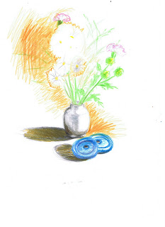
The pot isn't very good. Using markers though forced me to loosen up. Need to remember that the if I loosen up the details will tighten up as I go over it more time, but the drawing will have more “life.”

Assignment 3: Plants and flowers in coloured pencil – 10.08.11


  • Blending colours.
  1. Obviously, when two colours are blended you get a different colour.
  2. Because of the nature of this particular medium, this new colour looks quite bland.
  3. Dark colours and light light colours shouldn't be mixed in layers – the darker will take out the other

12.02.11
The actual drawing didn't go so well. Some of the flowers were almost completely white and this threw me. It didn't help that the background was a rich orange either. However, what it all really comes down to is that I rarely have used coloured pencils in the past.

Assignment 3: Negative space in a plant – 08.02.11

 
At first I found this hard going – overcome a little by the detail. Had to focus on the negative. Certainly an exercise in which the more time spent, the better it would look (I spent a little over 2 hours).

It isn't brilliant. But it is fairly accurate in its portrayal – you can certainly tell what the subject was. Need to make sure that I never get stuck in one area of a work. Moving around is important.

Assignment 3: Drawing fruit and vegetables in oil pastel – 03.02.11

 
Couldn't stand the oil pastels. The so easily break into pieces that can't be removed without smudging the drawing. Fairly happy with the basic image. Found it very, very hard to lay down layers with oil pastels

Research point: “Find out about Ben Nicholson. Why does he simplify still life forms and negative space and superimpose them on the Cornish landscape?”

Paintings from the 1940s often show landscape observed through a window with still-life elements in the window. Nicholson was an abstract painter usually. Moved to Cornwall after the start of World War 1. When he first came to Cornwall, he was busy working on reliefs and carvings.

People like Christopher Neve believe that landscape by itself has no meaning. Thus he believe that to paint it as it is would create a work without meaning. There has to be something of the artist's feeling in it – or so he believed.

Assignment 3: Drawing fruit with marker and or dip pens – 20.01.11

 
Really didn't like this one. To worried about the ink bleeding through the page to lay down many layers of tone. Basic shapes were alright. The marker don't lend themselves to mixing colours

Assignment 3: Using hatching to create tone in fruit and vegetables – 20.01.11


Loved this exercise! Loved working with colour (although the final work was by no means perfect). However, you can, I think, get away with more mistakes in portraying fruit and vegetables.

Assignment 3: Still life group in tone – 17.01.11

 
Have had to use colour and work fast. Colour does add a whole new dynamic to the work. Here, very often the colour wouldn't change but the tone would. In the last assignment I got a kicking for not really understanding the underlying structure of the human face. So I invested in a life-like, plastic skull. I used it in this composition in order to get some much needed practice. There was a problem in this drawing as I failed to foreshorten the lower, right jaw.

However, this drawing does show that I've a long way to go with tone. The differing colours showed very clearly any mistakes in that respect.

Assignment 3: Still life group using line – 17.01.11

 
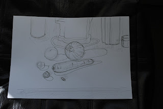
Had to set up a group of still life objects and draw them using just line. Had to also include background details. It went better with the subjects (e.g. the onion) that had internal qualities that could easily be described with line and give the illusion of depth. Line work need to be more fluid with more variance in the line thickness. For me linework seems to be all about speed. When you draw, do so quickly (spend a long time looking before though).

Assignment 3: Stipples and dots – 13.01.11


Subject was a flower. A whit one. The drawing is a bit more loose, yet there is little in the way of stipples and dots. Maybe the subject didn't lend itself easily to this. Could have done with a “woodier” subject.

Assignment 3: Getting tone and depth in detail – 13.01.11

 
This was all about creating depth into a drawing. So, areas of strong contrast. Here, I think, the drawing was alright. Maybe there could have been more light tones and less medium. The real problem was texture. The subject was a pear. It had a fairly rough texture and I didn't really catch that. I could also have been looser with my lines.

Assignment 3: Line drawing detail – 09.12.10


Far more used to working with tone, rather then with linework, by itself. Finding this one a bit hard going. Drawing is supposed to be of a carrot. However, my hand wasn't loose enough – took it off the page several times. May do attempt this exercise again, before moving on.

14.12.10
Had a second go at it. Really, no better then the first. Could it be that for line you have to study the drawing for longer before beginning? Found it hard not to use tone. Long, continuous lines were hard also.

Research point: “Find an artist who uses line drawing often. What are the strengths of working with line? What can you learn from the way this artist works?”

Had a look at the linework of such artists as:
  • Leonardo de Vinci
  • Albrecht Dürer
  • Picasso
  • Egon Schiele
  • The ancient greek lineworkers

Some observations:
  • To express form it is rarefor an artist to use completely continuous lines. When Picasso does this in his “Women in Russian Blouse II” the final image looked quite flat. Whereas Dürer's work (although it does have some long lines within it) is more broken up in order to express form.
  • The key seems to be finding the essential details and to focus on them (this, of course, depends on the aspects of the subject you are seeking to portray).
  • The other thing that is varied in order to portray form is strength and thickness of line.

Now have a greater admiration for this type of drawing.

Assignment 3: Exploring coloured media – 02.12.10


Here the key was in understanding how colours interact with one another. By itself any colour colour can be used as a like a black and white version of the same medium. It is only when they interact with one another that new aspects have to be considered.
  • Colours should be put down in the order of lighter to darker – generally speaking. Otherwise the light is lost in the darkness and it is much more harder with colours to get rid of tone.
  • The more layers of colours, the darker the tone (regardless of the colour – with the exception of white).
  • Both cross-hatching and dappling are effective ways of merging one colour with another (the resulting tone is less dark with dappling).

Crayons and pencils come out looking a bit smoother then pastels. So pastel are useful when an image needs to be roughened up to breath life into it.

Research point: “Find some examples of artists' work exemplify mastery of detailed drawings and make notes about their work.”

Looked at Leonardo de Vinci and Rembrandt, taking particular note of Leonardo's “Chiaroscuro.” Have noticed it in other, more modern works. Essentially it differentiates between tone and colour. So putting colour into a painting doesn't actually affect the tones. It makes luminance and shadow much more clear – usually upping the contrast. Love this principal. Love the colour, life and contrast it creates in works.